Why Your Shopify Variant Strategy Might Be Costing You — and How to Fix It
Discover how small structural changes can lead to smoother customer experiences. A smarter approach to variants, bundles, and product linking that improves UX and keeps your inventory clean. If you’ve been running your Shopify store for a while, you’ve likely hit a familiar wall
Discover how small structural changes can lead to smoother customer experiences.
A smarter approach to variants, bundles, and product linking that improves UX and keeps your inventory clean.
If you’ve been running your Shopify store for a while, you’ve likely hit a familiar wall: your product pages are getting cluttered, your variant options are spiraling out of control, and somehow managing inventory feels harder than it should be.
You’re not alone — and the good news is, there’s a better way to handle it. Let me explain.
The Problem with Traditional Variant Setups
Let’s say you sell one or two core products, but you also offer them in different sizes or bundles. Maybe you’ve been using variants to handle everything — a single product with a dropdown for sizes, bundles, colors, and who knows what else.
That setup works fine at first. But over time, it becomes messy:
-
Inventory gets harder to track
-
Bundles don’t always reflect stock accurately
-
The buying experience starts to feel clunky
And if you’re scaling, that friction adds up both for your team and your customers.
A Real-World Fix Using Shopify Bundles + Metafields
We recently helped a client with this exact problem. They had a best-selling deodorizing spray sold individually and as a bundle. Instead of stacking all of those options into one product with variant logic, we used the Shopify Bundles app to create a separate bundle product built directly from the base item.
Then, to tie it all together on the front end, we added a custom selector powered by metafields. To the customer, it feels like they’re just toggling between options, but behind the scenes, they’re actually switching between separate products.
Better UX, Smarter Inventory
This method gives you the best of both worlds:
-
Each product has clean, manageable inventory
-
Your bundles reflect real stock levels
-
Customers see a polished, intuitive selector on the product page
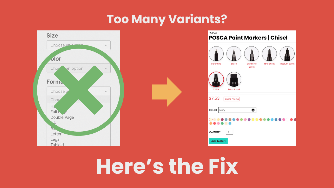
We’ve also used this same technique for a store selling multi-tip paint markers — where each marker type (fine, chisel, etc.) is its own product, and metafields link them together visually using custom images. It feels like a variant switcher, but under the hood, it’s a much smarter structure.
Why This Matters for Growth
These aren’t flashy overhauls. They’re small, strategic improvements that make your store easier to manage and more enjoyable to shop. And when you’re already seeing traction and looking to grow, that’s exactly the kind of advantage you want.
Want to Clean Up Your Product Pages?
At Three Acres, we specialize in solving the kinds of structural and UX problems that sneak up on successful stores. If your product listings are getting unruly, or you just know there’s a cleaner way to do things — we’d love to help.Get in touch → [https://threeacres.ca/contact/\]